

Utility and Energy Data Reporting for Sunshine Coast Firms
See how Sunshine Coast businesses turn scattered utility bills and meter data into weekly dashboards that actually drive decisions.
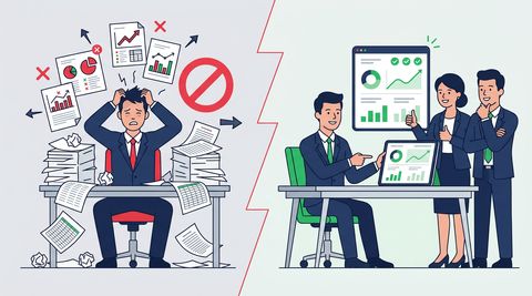
Here's what utility and energy data reporting looks like in a lot of Sunshine Coast businesses right now: a folder of PDF invoices from three different retailers, a spreadsheet someone updates when they remember to, and a finance manager who can tell you last quarter's power bill but not which site is driving the blowout. Now picture the alternative. One dashboard, updated automatically, showing consumption and cost by site, by meter, by month, with the anomalies flagged before they hit the invoice. That's the gap this article is about closing.
Utility and energy data reporting isn't just a finance task anymore. For hospitality groups running multiple venues along the coast, healthcare clinics juggling equipment loads, and construction firms tracking site power against project budgets, it's become a genuine operational lever. The businesses getting ahead of it aren't necessarily bigger. They're just better organised about a cost line that used to get filed and forgotten.
Why Sunshine Coast Businesses Are Rethinking Their Utility Data
The Sunshine Coast economy has a particular shape. Tourism and hospitality dominate the coastal strip, healthcare and aged care are expanding fast inland, construction is riding a long building boom from Caloundra to Noosa, and a growing professional-services base sits behind all of it. Each of these sectors has a different relationship with energy and utility costs, but they share one problem: growth has outpaced the reporting.
A tourism operator with two properties five years ago might now run six, each with its own electricity account, water meter, and gas connection. A clinic that once had one site now has three, each with different equipment loads and different peak demand patterns. The spreadsheet that worked fine at one site becomes unmanageable at six, and by the time someone notices a bill has doubled, three billing cycles have already passed.
This is where energy and utilities reporting earns its keep. Done properly, it's not about drowning in kilowatt-hour data. It's about surfacing the handful of numbers an owner-operator actually needs to make a decision this week, not next quarter.
What Good Reporting Actually Tracks
Consumption Metrics That Matter
Most businesses start by tracking spend, which makes sense because that's what shows up on the bank statement. But spend alone hides the story. A bill can rise because usage went up, because a tariff changed, or because a retailer quietly moved you to a worse rate. You need to separate those causes to act on them.
- Consumption by site and by meter, not just a combined total across the business
- Peak demand periods, especially for businesses on demand-based tariffs like commercial kitchens or clinics with imaging equipment
- Cost per unit of output, such as energy cost per guest night, per patient visit, or per square metre built
- Water usage trends alongside electricity, particularly relevant for agribusiness operations west of the Coast
- Comparison against the same period last year, adjusted for occupancy or activity levels
The Trade-Off Between Detail and Usefulness
There's a real trade-off here worth naming honestly. Interval meter data can give you consumption in fifteen-minute blocks, which sounds impressive but is genuinely overwhelming without the right dashboard behind it. Too much granularity and your reporting becomes a data lake nobody visits. Too little and you miss the operational insight that makes the whole exercise worthwhile.
The right level of detail depends on who's looking at the report and how often. A site manager checking in weekly needs different granularity to a finance team doing quarterly reconciliation against retailer contracts. Good dashboards handle this by giving each audience their own view of the same underlying data, rather than forcing everyone into one dense spreadsheet.
A Worked Example: Consolidating a Multi-Venue Hospitality Group
Consider a hospitality group with venues scattered between Mooloolaba and Noosa, five sites in total, each with its own electricity retailer relationship inherited from when each venue was acquired separately. Before any reporting rebuild, the finance team spent roughly two days a month manually pulling numbers from five different retailer portals into a master spreadsheet, and even then, it only showed total spend, not consumption trends or anomalies.
The rebuild started with data consolidation: pulling billing and, where available, interval consumption data from each retailer into a single structured source. From there, a dashboard was built showing consumption per venue, cost per covers served, and a simple traffic-light flag for any site tracking more than ten percent above its trailing average. That flag turned out to be the most valuable feature in the entire build.
Within the first month, the flag caught a walk-in cool room at one venue running continuously overnight due to a faulty door seal, a fault that had been quietly adding several hundred dollars a month to the power bill for an unknown period. The fix cost almost nothing. Finding it without the dashboard would have taken another lucky glance at an invoice, if it happened at all.
Building the Reporting Layer Without Enterprise Overhead
Start With What You Already Have
You don't need a smart-metering rollout or an enterprise energy management platform to get meaningful reporting off the ground. Most Sunshine Coast businesses already generate enough data through retailer billing portals, existing point-of-sale or practice-management systems, and basic site records to build a genuinely useful first version.
The mistake growth-stage businesses often make is waiting for the perfect data source before starting. A construction firm doesn't need every site wired with smart meters to start tracking generator fuel and site power costs against project stage. A clinic doesn't need a building management system to start comparing energy cost per patient visit across locations. Start with what exists, and let the gaps in that data tell you where to invest next.
Where Power BI Fits for Growth-Stage Businesses
Power BI has become the practical middle ground for businesses that have outgrown spreadsheets but don't need, or can't justify, a full energy management platform. It connects to the messy mix of sources most Sunshine Coast businesses actually have (retailer exports, accounting software, site spreadsheets) and turns them into one live view without months of implementation.
For an owner-operator, the appeal is straightforward: one login, refreshed automatically, showing the handful of numbers that matter for this week's decisions. It scales with the business too. What starts as a five-site hospitality dashboard can extend to labour cost and food cost reporting later, without rebuilding the whole system from scratch.
Edge Cases That Trip Up Utility Reporting Projects
A few situations come up often enough on the Sunshine Coast that they're worth planning for from the start, rather than discovering them halfway through a build. Seasonal tourism sites, for one, see consumption swing wildly between peak season and the quieter months, which means simple month-on-month comparisons are almost meaningless without adjusting for occupancy or trading days.
Multi-tenant sites are another common snag, particularly in retail strips and commercial buildings where a single meter covers several businesses. Getting a fair, defensible cost allocation across tenants usually needs either sub-metering or a clearly documented allocation formula, and skipping that step tends to create disputes later. Agribusiness operations bring their own wrinkle too, with irrigation pumping loads that spike hard during dry periods and can distort averages if they're not reported separately from general site consumption.
- Seasonal demand swings that make raw period comparisons misleading without occupancy adjustment
- Shared meters across multiple tenants or business units needing a fair allocation method
- Irrigation and pumping loads in agribusiness that should be reported separately from base consumption
- Retailer contract changes or tariff resets that alter unit costs mid-year without any change in actual usage
- Equipment-heavy sites, like clinics with imaging machines, where a handful of assets drive most of the demand charges
None of these are reasons to avoid building better reporting. They're reasons to build it properly the first time, with someone who's seen the patterns before and knows which assumptions will quietly break the numbers six months in.
Getting the Reporting Cadence Right
One thing we hear consistently from Sunshine Coast business owners is that they don't want theoretical models or annual sustainability reports. They want a number they can check on a Monday morning that tells them whether last week was normal or not. That's a fundamentally different design brief to the kind of reporting a large corporate energy team might build, and it should shape every decision in the project.
That means fewer metrics, checked more often, beats more metrics checked rarely. A weekly dashboard with three or four clear indicators, consumption trend, cost trend, and an anomaly flag, will get used. A comprehensive quarterly report with forty tables will get opened once and then ignored. Design for the cadence your team will actually follow, not the one that looks most thorough on paper.
It's also worth building in a simple escalation path. If the anomaly flag trips, who looks at it, and what do they check first? Reporting without an owner tends to decay quietly, dashboard still running, nobody looking at it, until someone stumbles on a bill that's blown out for months.
Where to Start If You're Still on Spreadsheets
If your utility and energy data reporting still lives in someone's inbox and a monthly spreadsheet update, you're not behind, you're just at the point most growing Sunshine Coast businesses reach eventually. The businesses that move first usually start small: one consolidated view across sites, one anomaly flag, one clear owner for checking it weekly. From there, the reporting grows as the business does.
Roar Data works with Sunshine Coast businesses across tourism, healthcare, construction, and professional services to build exactly this kind of reporting, practical, owner-friendly dashboards that turn scattered utility data into decisions you can act on this week. If your energy costs feel like a mystery you only solve after the bill arrives, get in touch and we'll show you what a working version could look like for your business.
For the wider picture of how this work is run, our Power BI consulting approach across Australia sets out the stages and what each one is meant to settle.
Does this sound familiar?
If your reporting has these same friction points, talk through what should change first.
More insights
Automated Reporting Australia: A Sunshine Coast Guide
Still rebuilding the same reports every week? Here's how Sunshine Coast businesses are moving from manual spreadsheets to automated reporting that just works.
Power BI Mining Reporting for Queensland Resources Companies
Queensland mining companies use Power BI to turn shift reports, safety records, and equipment data into real-time dashboards their teams can act on.
How Brisbane Real Estate Agencies Use Power BI Dashboards
Brisbane real estate agencies are turning to Power BI to track listing performance, agent KPIs, market trends, and portfolio data in one place.
Related services
Power BI Dashboard Development Brisbane
Dashboard development for Brisbane businesses that need clearer management reporting, stronger KPI accountability, and less spreadsheet rework.
Explore servicePower BI Consulting
Roar Data helps Australian organisations eliminate spreadsheet reporting, unify fragmented systems and deliver real-time executive, financial and operational dashboards using Microsoft Power BI.
Explore servicePower BI Managed Services
Ensure your dashboards stay accurate, secure and performance-ready with proactive Power BI monitoring, optimisation and continuous improvement.
Explore serviceGet a practical view of what your reporting should look like
If the issues in this article sound familiar, we can review your current reporting environment and show where the friction is coming from.